
Brand identity
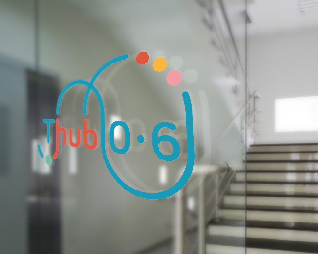
Thub 06
Branding for kids
Thub06 brings together various initiatives dedicated to social projects in the suburbs of Turin, focusing especially on children aged 0 to 6 in vulnerable situations. Each member of Thub06 provides support to families facing educational, economic, and social challenges—such as immigrant families, low-income households, and families with disabled members—to combat educational and social poverty and to build an independent network of citizens capable of creating a functional society.
I contributed to promoting the project by designing its visual identity and assisting with communication management. Centered on the project’s core mission, I created the logo using Bariol, a typeface from Atipo Foundry, available in free regular and italic styles. I emphasized themes of community, society, and togetherness by linking the letters with a blue line, forming a visual metaphor for a network. This design also evokes the image of an abacus—a classic educational tool for teaching math to children—which symbolizes the importance of multiple elements working together to achieve a goal. The color palette is inspired by the typical hues of toys for children aged 0 to 6, reinforcing the project’s focus on early childhood.